
On-chain analysis is a mode of analysis that is unique to cryptocurrency assets. The analysis pertains to using data from the publicly auditable blockchain to generate information. Equity analysts closely examine press releases and financial reports in search of data that may inform their decision-making and outlook. Similarly, Bitcoin analysts can turn to the publicly auditable data of the blockchain to shape their views.
A handful of analysts pioneered the field of on-chain analysis. Willy Woo was potentially the first to package data from the blockchain into an indicator when he proposed the Network Value to Transactions (NVT) ratio in 2017. The NVT relates the market capitalization of Bitcoin to transaction volume and Woo proposed that the metric could be used to identify instances when the market was overbought or oversold.
In recent years, the field of on-chain analysis has immensely grown in popularity. Several analysts have emerged and designed proprietary indicators. Analytical products have launched that provide users with historical charts of these indicators. Similar to indicators in the traditional markets, the value of the information lying in most of these indicators is questionable.
Nonetheless, some of these indicators can be particularly useful. On-chain indicators which are based on simple logic oftentimes provide the most useful and actionable information. As with any indicator, they need to be used tentatively if they’re being used to forecast future price action. In this Compass article, we detail four on-chain indicators which we have found to be particularly useful in conveying information relating to the Bitcoin mining industry and Bitcoin market dynamics.
The Puell Multiple

The Puell multiple puts the value of recent Bitcoin into a historical perspective. The USD value of daily issued Bitcoin is divided by its 365-day moving average to derive the multiple. The metric was designed by analyst David Puell. Puell further outlined arbitrary areas where he feels the multiple has historically been too little (the green area below) or too great (the red area below). The red and green areas are considered to be areas for speculative profit-taking and entering respectively. A higher multiple shows that recent issuance rewards have been higher than their yearly average and vice-versa. Changes in the multiple can be used to assess how miner revenue has responded to recent price and difficulty changes.
Read More: What is Bitcoin Difficulty and Why Does It Matter?
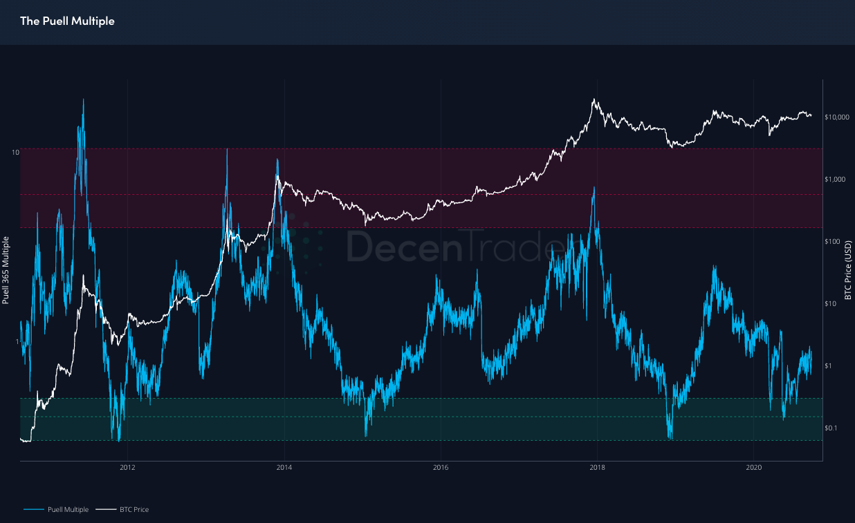
The Puell Multiple can still give information related to how miner revenue has responded to difficulty adjustments. For instance, the most recent adjustment where the difficulty level of mining increased by 11.35% was followed by a significant reduction in the USD value of block rewards. In the two days following the upward difficulty adjustment, the Puell Multiple reduced by roughly 12%. Bitcoin price also recorded a decline of approximately 6% over these two days which also needs to be factored in. Nonetheless, the Puell multiple highlighted that the USD value of Bitcoin issuance was significantly impacted by both the falling price and the rising difficulty.

The block reward has historically accounted for the vast majority of Bitcoin miner revenue. Before the third halving in May 2020, the block subsidy commonly accounted for over 98% of a miner’s revenue. Since the third halving, transaction fees have accounted for a greater portion of the total block reward. A more effective future on-chain indicator for assessing how miner revenue has responded to difficulty adjustments would also take fees into account.
Aggregate Security Spend (Thermocap)
As a whole, the Bitcoin mining industry operates just above the margin. For every extremely efficient miner that has secured $0.01 per kWh rates and is operating at wide profit margins, there are countless inefficient miners that may have overpaid wildly for mining equipment and will fail to ROI on their capital.
The idea that the mining industry operates just above the margin is grounded in economic theory. David Sztorc dedicated a blog post to explaining this:
“Econ 101: Marginal Cost = Marginal Revenue. If a block releases X dollars worth of coins to the creator, X dollars will be spent creating it.”
With the industry roughly operating around breakeven, the cumulative revenue earned by miners can be used to gauge how much has been invested in Bitcoin mining infrastructure. Aggregate Security Spend, also known as Thermocap, measures this.
As it stands, Thermocap estimates that $18.39 billion has been invested in Bitcoin mining infrastructure. Change in Thermocap can be used to estimate the investment in a given timeframe. For instance, the indicator suggests that $5 billion was invested in infrastructure in 2019.

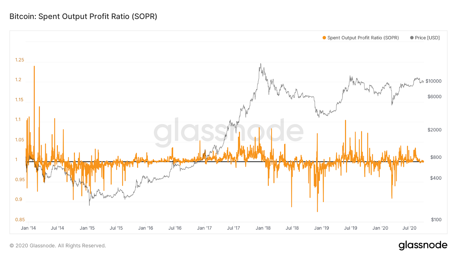
Spent Output Profit Ratio (SOPR)
The SOPR is calculated by dividing the cumulative value of Bitcoin transaction outputs by the cumulative value related to when those transactions were created (i.e. inputs). If we operate under the assumption that the inputs relate to when the bitcoin was purchased and the outputs relate to when the bitcoin was sold, the SOPR effectively represents a profit ratio for all Bitcoin holders.
This can be used as a proxy for whether current holders are in profit or loss. Whether an investment is in profit or loss holds huge psychological importance for investor decision-making. One of the most widely recognized phenomena in the behavioural finance literature is that investors simply do not want to sell at a loss.
This phenomenon gains further credibility when historical data for the SOPR is observed. When Bitcoin price is trending upwards, instances when the SOPR approaches one (i.e. loss-making territory) are usually quickly reversed. The theory underpinning this is that investors do not want to sell for a loss and the alleviation of selling pressure creates more suitable conditions for Bitcoin price to rise. On the opposite side, downward trending markets are often accompanied by the SOPR failing to surpass one (i.e. profit-making territory). In this instance, investors that held to positions that were in loss-making territory are eager to sell once the investment turns profitable. Sellers rush in as the SOPR approaches one adding downward pressure on the market.
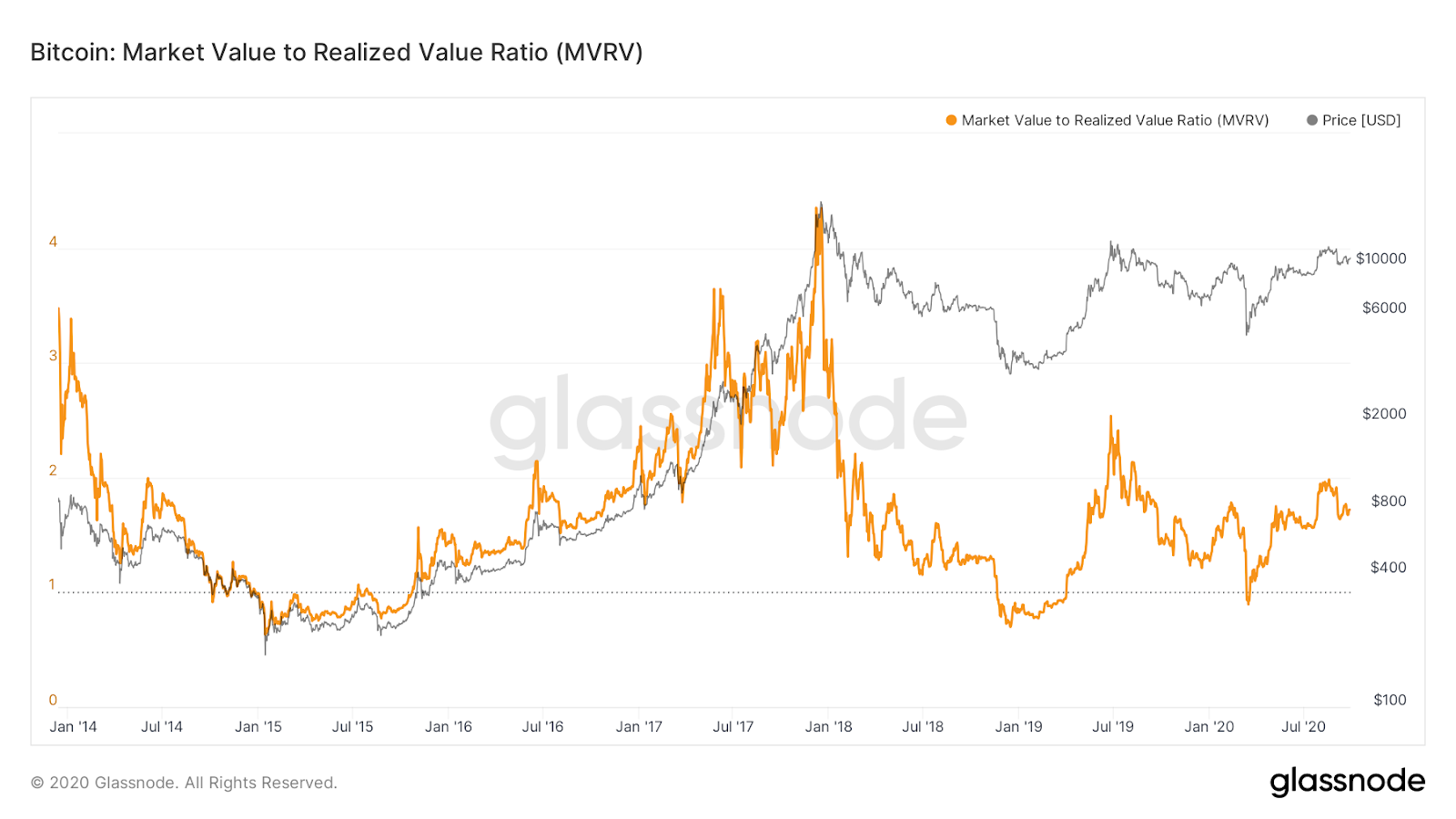
Market Value to Realized Value (MVRV)
The MVRV metric compares the current market valuation of Bitcoin to an alternative on-chain valuation. Standard market capitalization is calculated by multiplying the circulating supply by the current market price. Sharp fluctuations in price will cause sharp fluctuations in market cap even if there has been little activity on the blockchain. Moreover, lost or unmoved coins make the same contribution to the market cap value as coins which are frequently moved.
CoinMetrics proposed an alternative metric for valuing the Bitcoin network based on underlying network activity. The metric – Realized Valuation – is calculated by aggregating the product of all UTXOs with the market price when they moved. That’s a lot to take in but it can be broken down simply. If my last transaction (UTXO) was 1 Bitcoin and the market value was $10,000 at that time, this adds $10,000 to Realized Valuation. You aggregate this with each individual transaction to get the Realized Valuation. This helps adjust the value for lost or long-unmoved coins. If a coin was last moved when the price was $100, these coins would contribute far less to the valuation than coins which were recently transacted.
The MVRV is the ratio of market cap to realized valuation. When the ratio drops below 1, current market valuations are below the aggregate market value of all Bitcoin UTXOs. If UTXOs are considered as the market entry point, that would suggest that current market valuations are below the level at which investors, on aggregate, entered the market. Historically, drops below 1 in the MVRV ratio have coincided with the latter end of downward trending markets.
Bitcoin On-Chain Indicators – Overhyped or Underappreciated?
On-chain analysis is certainly an exciting emerging field of market analysis. We have found the above metrics to be useful for both enhancing understanding of mining dynamics and providing a view of the market dynamics which is grounded in on-chain data.
However, not all on-chain indicators live up to their lofty promises. Some analysts have derived metrics which leave a lot to be desired. In an upcoming Compass article, we will highlight the Bitcoin on-chain indicators that we feel are questionable.